Part 2 Follow the mental model, not the UI onscreen.
This is the second in a series of articles about things we learned while improving ChordBank’s accessibility for version 4.0. If you missed it, here’s part 1: Put things where users expect them.
Remember, there are two main ways users navigate the screen using voiceover:
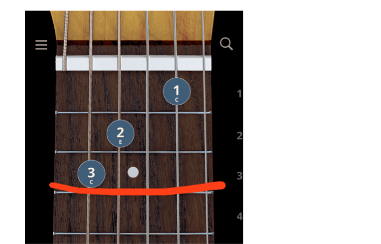
Let’s look at a naiive approach to representing a C major chord that may or may not have been a part of earlier versions of ChordBank.
(OK, it was.)
On the left, you’ll see the way a sighted person would see a C major chord. On the right, the red boxes represent a naiive way to translate that chord for users who need help with their vision:
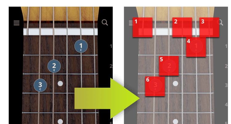
By default, in most locales, the system will try to organize things top to bottom, left to right. So, swiping from element to element, the user would hear something like:
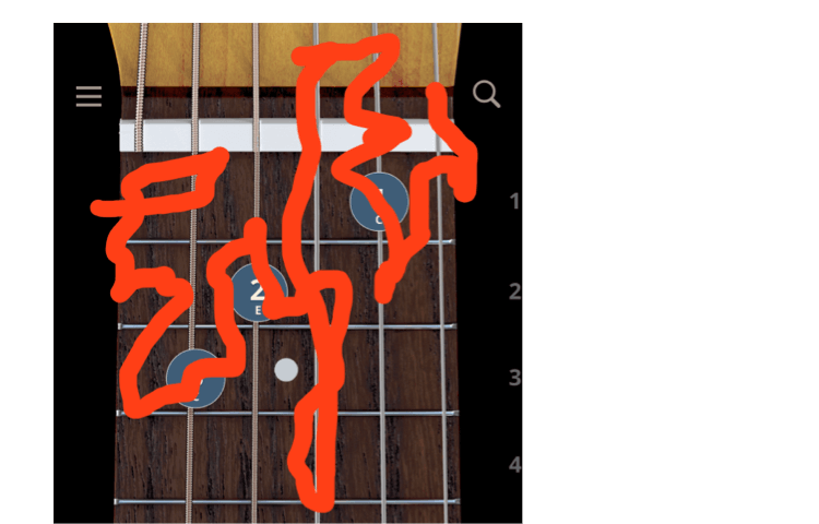
The strings are all out of order, which isn’t great. And we could fix that.
But there’s a bigger issue: imagine dragging your finger around the screen to explore.
Think about it for a moment.
(Close your eyes)
To find where you put your fingers… you need to know… where the fingers already are.
What path would you trace with your eyes closed to intersect with those boxes? Maybe something like this?
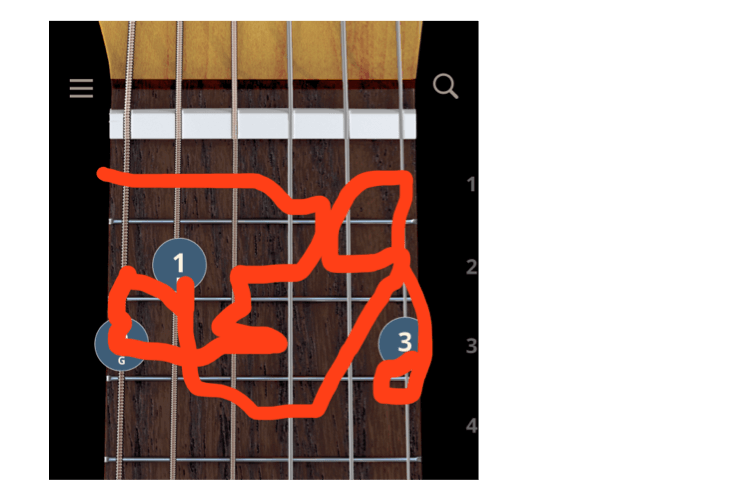
Let’s try another chord. Here’s a G major:
Let’s try another way.
What if, instead of thinking about the dots, we think about what the user is likely thinking about: the strings.
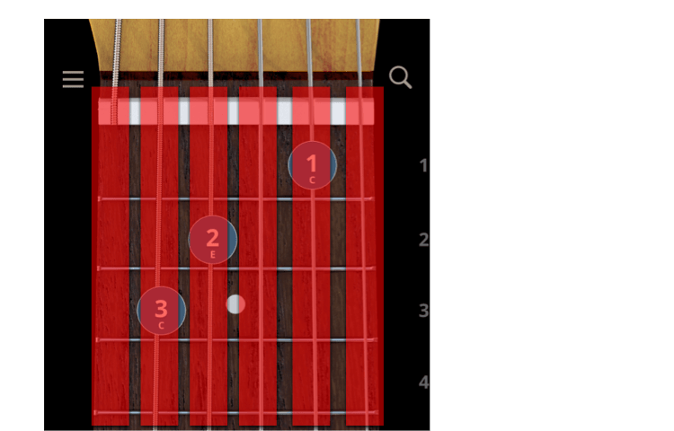
Swiping from element to element, the user would hear something like:
Much easier to follow.
And what about exploring, moving quickly from string to string?
Users can easily move from one string to the next and back again. And, because the voiceover elements are in the same place for each chord, it’s easy and predictable to find new chords.
Thank you for following along in this series about things we learned while improving Accessibility in ChordBank!
In our next article, we’ll look at how we can streamline controls for users who rely on voiceover.
Until then, keep playing, and we’ll see you next time. Update: Part 3 here.
Do you rely on Apple’s Voiceover technologies to use your phone? Can we do better, with our app, or with this website? Contact us to let us know, and thank you for sticking with ChordBank for all these years!
