Part 3 Don't make me swipe
This is the third in a series of articles about things we learned while improving ChordBank’s accessibility for version 4.0. If you missed it, here’s part 1 and part 2.
Or, longer title: combine multiple labels and adjustable controls into a single element where possible.
Our capo feature lets users place a virtual capo on their guitar.
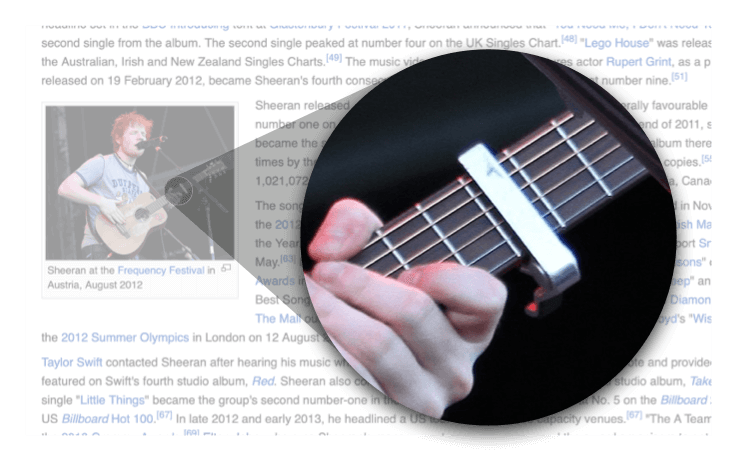
Capos allow players to play the same shapes at different places on the guitar’s neck to play different chords. Here is, for example, a photo of Ed Sheeran using one, taken from a random screenshot of his Wikipedia page:
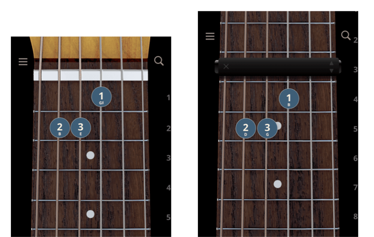
For example, here is an open E major chord. With a capo at the third fret, it becomes a G chord:
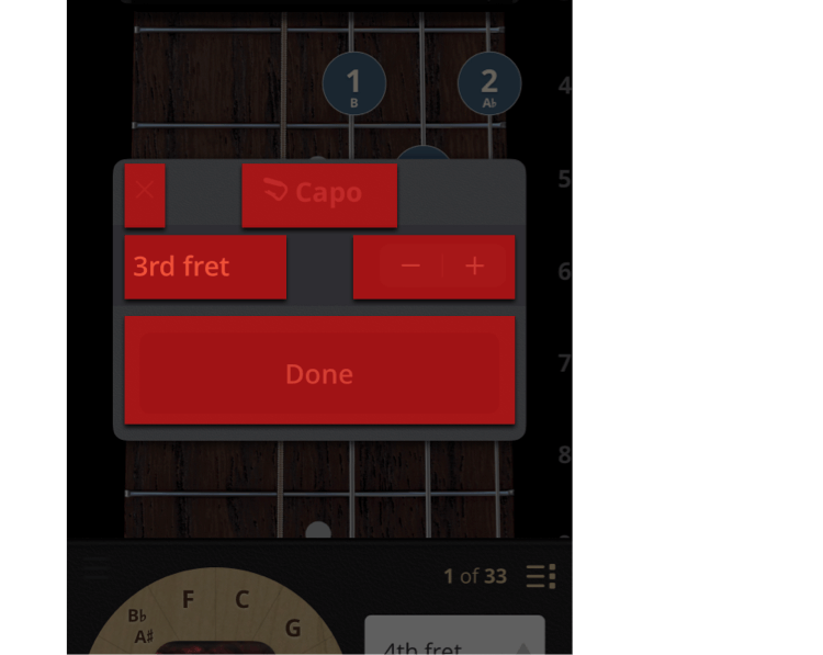
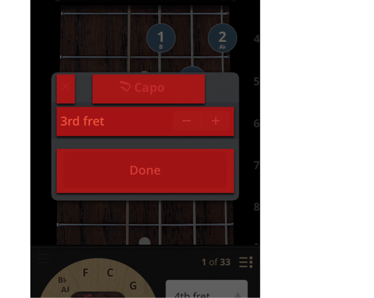
Here is the UI that lets users add, remove, and change which fret the capo is on:
This works great: we’ve got a standard UIStepper control, a label next to it that clearly states what it does.
Should be no problem, right?
It works, yes. But it could be a bit better.
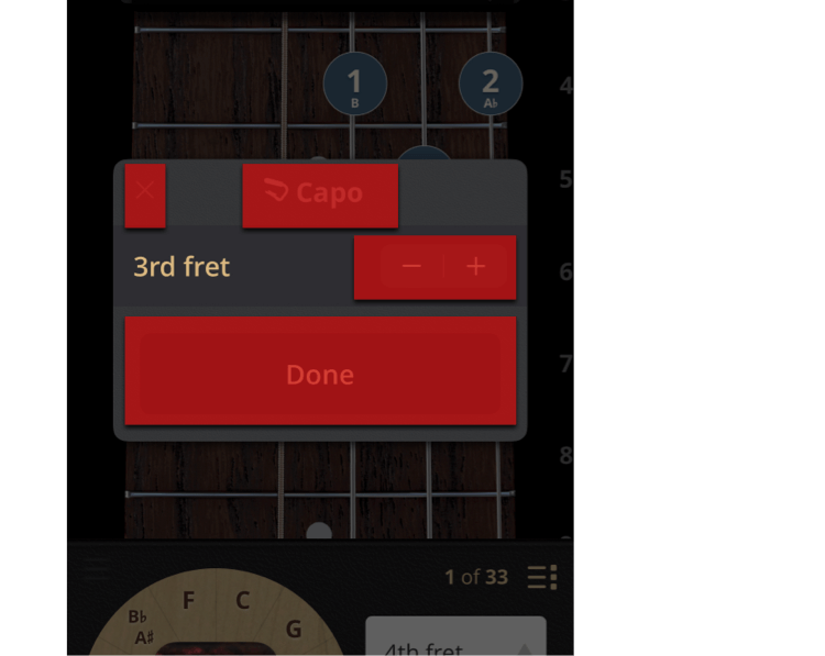
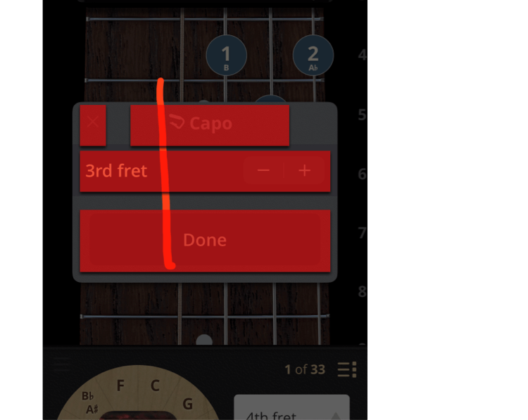
Here’s what that last setup would look like:
Imagine this from a visually impaired user’s perspective: they have to first swipe to the label that says “third fret”, but it’s just a label. Then they swipe to the stepper, which they actually can adjust.
Don’t make me swipe!
A better solution is to, where possible, integrate labels into the controls themselves.
A naiive way to do this could be to simply hide that extra label, and update the accessibility label of the stepper itself:
This is better. But, because the stepper is way over there on the right, the user is going to have a hard time finding it by panning around with their finger.
A better solution is to make the space occupied by the voiceover controls mirror the space that the sighted controls occupy in the user’s mind.
As a sighted person looks at these controls, the entire cell is understood to be about the fret that the capo is on.
So. Let’s make the voiceover controls match, regardless of what physical space the stock UI controls occupy.
There are a number of ways to go about this technically–you could tell the system your accessibility frame is different than your physical frame, for example.
In our case, we optimized the view that encloses both the label and the stepper to be an adjustable control, and called the same code we call from the stepper in response to swipes up and down from a Voiceover user.
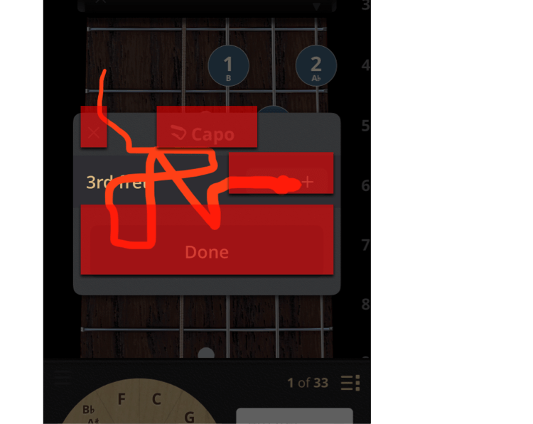
Ten minutes, a few lines of code later, and look at this squiggle test:
As the user slides their finger over the row with the label and stepper, they hear:
Much better.
Now, however they navigate the app, it’s easy for visually impaired users to play chords with capos.
Thank you for following along in this series about things we learned while improving Accessibility in ChordBank!
In our next article, we’ll take this one step further: manufacturing accessible regions for custom controls.
Until then, keep playing, and we’ll see you next time.
Do you rely on Apple’s Voiceover technologies to use your phone? Can we do better, with our app, or with this website? Contact us to let us know, and thank you for sticking with ChordBank for all these years!
