Part 1 Put things where users expect them.
This is the first in a series of articles about things we learned while improving ChordBank’s accessibility for version 4.0. If you’re into this kind of thing, be sure to check out part 2: Follow the mental model, not the UI.
There’s a great story about curb cuts. They were designed to help veterans who relied on wheel chairs. But they ended up being useful for cyclists, parents with strollers, rollerbladers. And they make it generally more pleasant to cross the street. This improvement for one group of people ended up being useful for just about everybody.
This lesson is like that.
For many, many years, ChordBank has had a menu button at the top right… of its other controls.
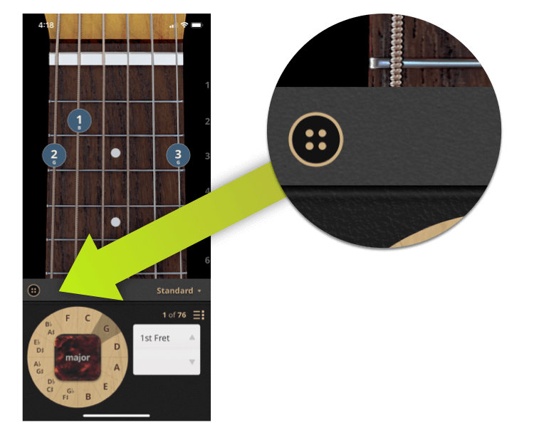
This is actually a very important button–you need it to:
And more.
Now, imagine for a moment you can’t see, or can’t see well, and you’re finding your way around this new app.
There are two main ways users go about this.
Where would you expect the settings button to be? Maybe someplace around here?
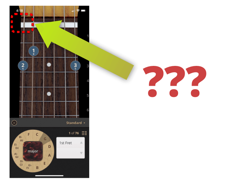
So, if you’re navigating with your fingers and your ears, you might wonder:
A much better solution: put the menu button where users would expect to find it.
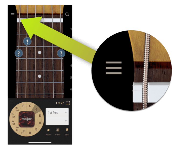
And it turns out, that works well for sighted users, too, in addition to giving us a nice, natural spot for the new search button, just opposite it on the other side.
One small addendum to this change for ChordBank 4.0, though: in testing, power users kept tapping the space where the old menu button used to be. And this is understandably frustrating: it used to be there for over 10 years!
So we came up with a solution: we added a second, non-descript settings button where the first once was.
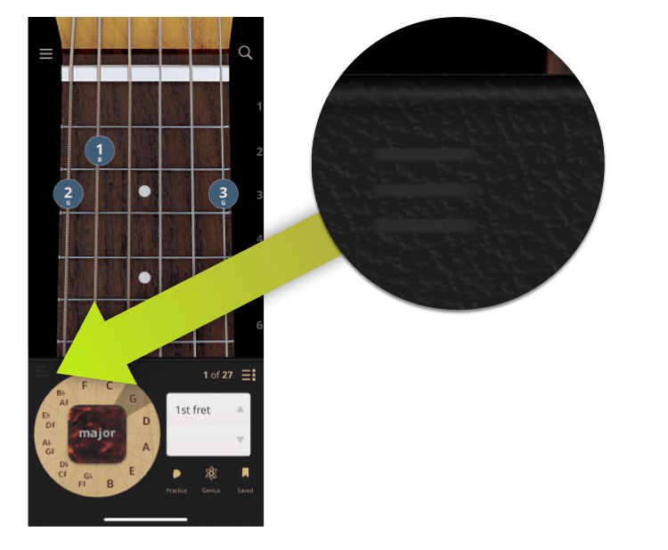
This way, there’s both a reliably placed button to access the most important screen in the app. And also one that’s easy to reach.
Will we keep it there forever? Maybe, maybe not. It’s not hurting anyone down there. But, at the very least, this eases the transition to the new control style, giving a more predictable interface for users who use our app without relying on their vision.
Thank you for following along in this series about things we learned while improving Accessibility in ChordBank!
In our next article, we’ll be looking into how you should think about fitting your app to the user’s mental model, not the UI onscreen.
Until then, keep playing, and we’ll see you next time. Just kidding, it’s up! Read part two here.
Do you rely on Apple’s Voiceover technologies to use your phone? Can we do better, with our app, or with this website? Contact us to let us know, and thank you for sticking with ChordBank for all these years!
